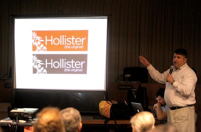
Giving a wink to Hollister Co., Arnett Muldrow
&
amp; Associates debuted a new branding scheme for Hollister,
claiming the city as
”
The Original.
”
The slogan, described as simple and in bold by Tripp Muldrow,
refers to the city as the origins of bikers, farming and the
balers
– and not trendy teenage clothing.
Giving a wink to Hollister Co., Arnett Muldrow & Associates debuted a new branding scheme for Hollister, claiming the city as “The Original.”
The slogan, described as simple and in bold by Tripp Muldrow, refers to the city as the origins of bikers, farming and the balers – and not trendy teenage clothing.
“It’s simple and, doggone, in your face,” Muldrow said, receiving a loud applause afterward. “This place is the origins of a lot of well known things, and the idea of ‘The Original’ has multitude of meanings to it.”
Arnett Muldrow & Associates had been hired by the Hollister Downtown Association to devise a new brand for the city, and the consultants had spent the past three days in the area coming up with ideas for the marketing strategy.
The slogan and Hollister name is in a sans-serif gotham font that is highlighted by colors found across the city and county, Muldrow explained. The presentation used colors from apricots, walnuts, leafy greens, cherries and grapes.
Muldrow said the final product is a work in progress because they came up with the tagline the previous night. Partner Ben Muldrow was working on other pieces of material as Tripp Muldrow spoke.
“We are still working on some late-breaking things,” Tripp Muldrow said.
The branding scheme also had pieces for downtown Hollister and local identities of the community such as the high school, farmers and bikers.
The downtown slogan was “the opposite of a mall,” highlighting the lack of a mall in the community. In the type, the “O” in Hollister has the clock tower resting in it.
The clock tower is also used in graphic pieces that tie into existing marketing logos, Muldrow said. Other bigger pieces had “stylized” pictures of fruits and produce from the community. All of the pieces to the brand used the same color scheme.
In advertising pieces, the slogan “The PERFECT place to bale,” was used to highlight the tie to the high school.
Muldrow said the branding scheme also used ideas of the county, trying to bring its attractions to Hollister.
“It’s important to make the county a part of Hollister,” he said.
To highlight local pride, the branding includes creating “The Original Hollister Model.” The model pieces, tying into the models of the clothing company, try to put the focus on the people of the community, Muldrow said.
“The most important piece of a community is the people,” he said. “We want to tell the story of the people that make this a real place.”
Adding onto the explanation of the brand, Ben Muldrow explained he wanted to use the confusion between the clothing brand and the community.
“We used the misunderstanding as a platform to tell your story,” he said.


